Flows can be easily made and edited in the Flow Builder, which helps you keep the main focus of your marketing and sales on your video, while making the design process simple.
Content
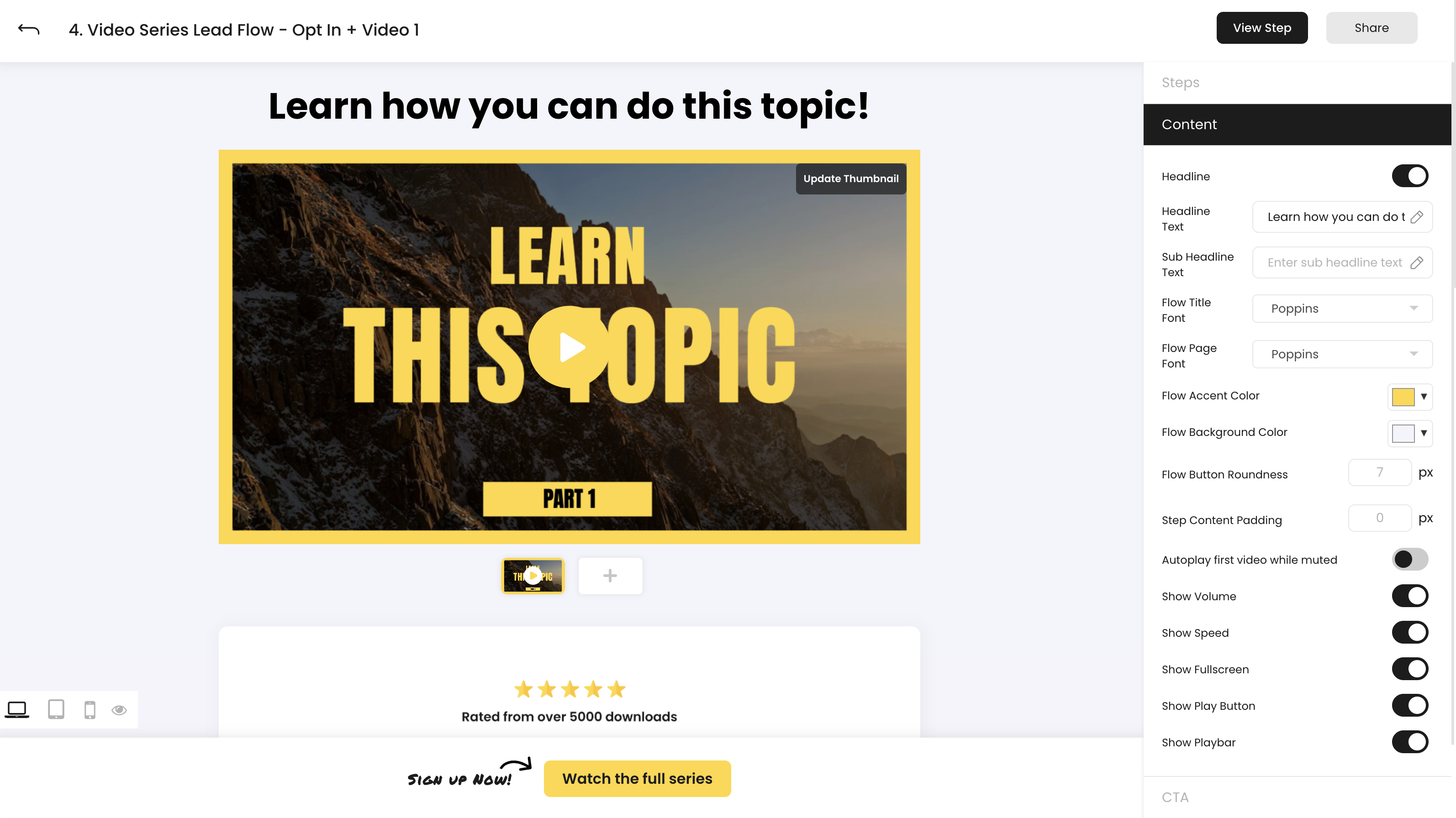
The content section in the Flow Editor lets you have control a number of page styles and video display options. On page style controls include:
- Headline - Include an optional headline to your Flow pages
- Headline Text - Modify how your headline text looks on your page with a number of options including Font Size, Font Weight, Text Color, Letters Spacing, Line Spacing (with options for mobile)
- Sub Headline Text - Modify how your subheadline text looks on your page with a number of options including Font Size, Font Weight, Text Color, Letters Spacing, Line Spacing (with options for mobile)
- Flow Title Font - Choose the font for your Flow headline
- Flow Page Font - Choose the font for the body copy of your Flow
- Flow Accent Color - Choose the accent color for on-page elements of your Flow like CTA buttons, cart details, and more
- Flow Background Color - Choose the background color of your Flow page
- Flow Button Roundness - Modify the corner rounding for your main Flow CTA (default value is 7px)
- Step Content Padding - Adjust the default padding between sections of your page (can be modified on an individual section basis on top of the default padding as well)
Video Controls
Like the controls available in the Videos Area, Flows also give you a number of display and playback options for your main on-page video.
- Autoplay first video while muted - The first video in your feature area starts playing automatically upon page load
- Muted - Video is muted at page load
- Show Volume - Volume can be adjusted
- Show Speed - Video speed can be set to 0.5x, 1x, 1.5x, 2x, 4x, and 8x speeds
- Show Fullscreen - Video can be maximized to fill the entire screen
- Show Play Button - Controls the video's play button over the thumbnail
- Show Playbar - Controls the entire video playbar
Flow Builder
Video and Media Feature
The main video and media feature area in Flows is where you can place your primary means of converting and selling in VidSell.
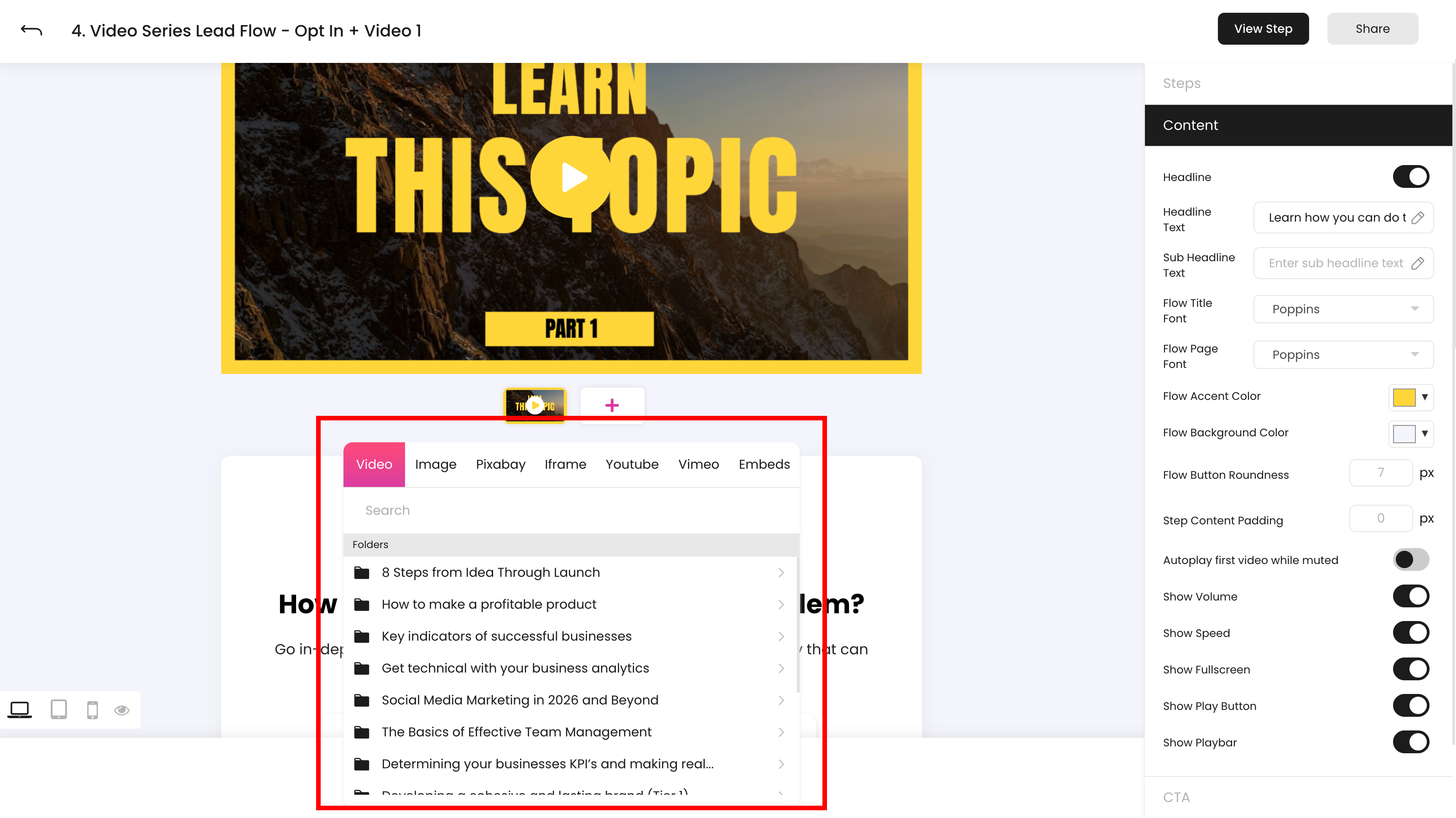
Media Selector
the media selector give you a number of options for adding your content to the main video and media feature area, as well as within sections on-page.
- Videos - Use videos organized into folders in the Videos Area in your marketing and sales flows
Note: The video in the first media slot can be controlled through the Content Tab video controls, such as "Autoplay first video while muted".
- Image - Upload an image from your computer as support to your main video, or instead of a video
- Pixabay - Choose an image for your Flow from Pixabay
- Iframe - Allows you to embed iframed content into your Flow, and allow your iframe to be scaled
- YouTube - Enter a YouTube video URL directly into the Flows area
- Vimeo - Enter a Vimeo video URL directly into the Flows area
- Embeds - Embed content into your Flow like forms or other media
Sections
Sections make up the body content of your Flow page and include multiple available elements to help you convert and sell online.
How to add a new page section
To add a new page section, click the "Add New Section" button within the content area of your Flow.
Media
Choose from any of the media available in the media selector including Videos, Image, Pixabay, Iframe, YouTube, Vimeo, and Embeds.
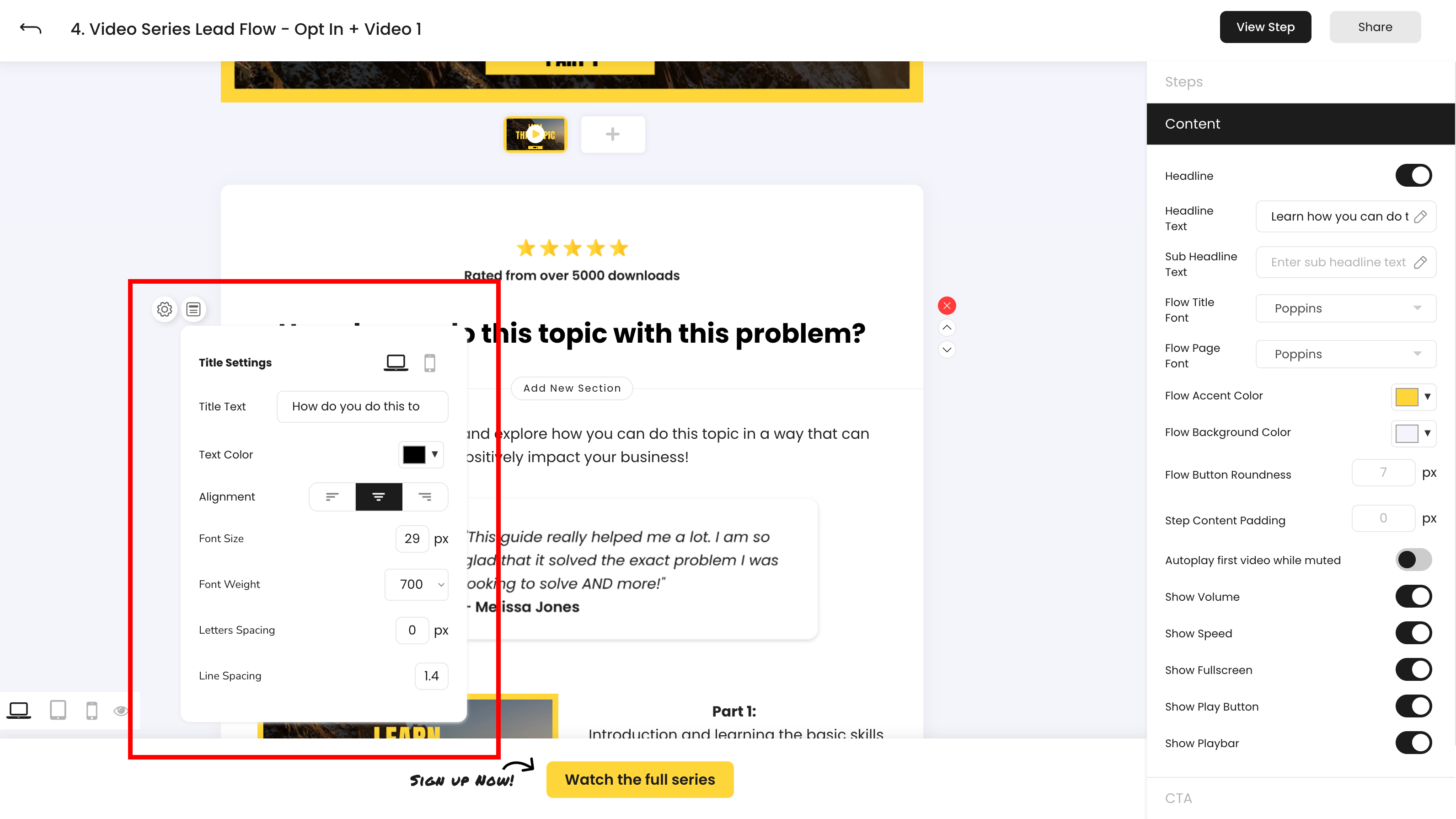
Title
Titles give you a number of controls over how your on-page healings look including Title Text, Text Color, Alignment, Font Size, Font Weight, Letters Spacing and Line Spacing - all controlled from the left side menu.
Text
Flows text allows you to write your page copy with a number of options in a full rich text editor including Paragraph, List, Checklist, Embeddable code snippets, Space, and Table. You can also adjust the alignment of your text and control options like bolding, italics, highlighting, linking, strikethrough, underline, and inline code.
Button
On-page buttons give you the option to perform multiple actions in Flows in addition to your main CTA button. Available button destinations include going to a specific step of your Flow, linking to an external URL, performing the same action as your main CTA, and downloading a file. You can add multiple buttons per page as well for cases like Link-In-Bio Flows and more.
Counter
The counter section allows you to create evergreen and countdown timed offers within your Flows.
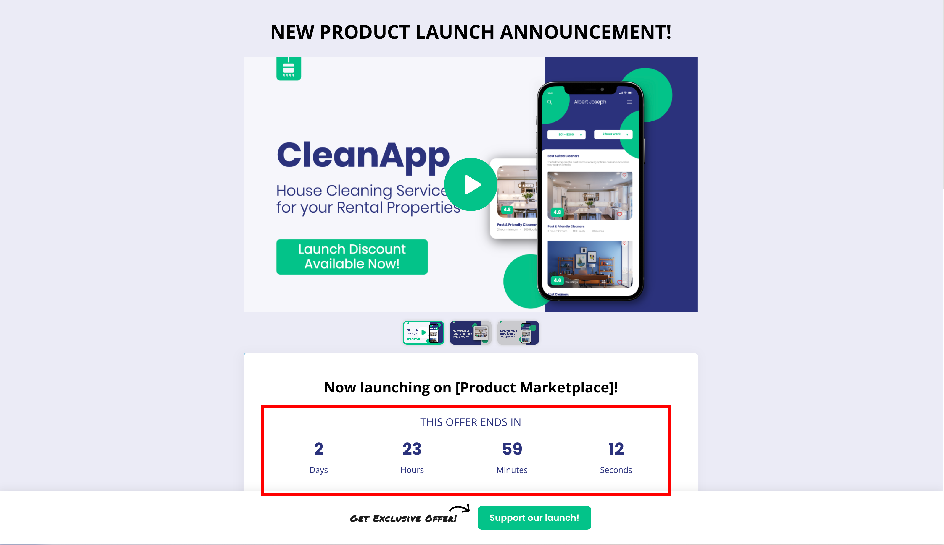
- Evergreen timers allow you to set a timer for a page or offer that will expire at a set amount of time after a visitor has landed on your page. For example if you have a promotion you'd like to continually run that allows 30% off your product for 3 days only, an evergreen timer can allow your audience to all get this offer at different times.
- You can set how long you would like your timer to be by setting your Timer Type to "Evergreen" and entering the number of days, hours, or minutes you would like your offer to appear for.
- Countdown timers allow you to set timers for your pages that expire at a set date. For example if your 30% off promotion was only going to be live for a specific week in the year, a countdown timer could make the offer live for your entire audience only until that time.
- To set up a countdown timer, set your Timer Type to "Absolute" and then enter the date and time you would like your timer to expire.
- Expiry actions control where your Flow visitors are redirected to if they visit your page once your timer expires. The available redirect options linking to another URL or to another step in your Flow.
Card
Cards are a simple way to format your pages across devices, and include 3 pre-loaded sections: media, text, and a button. Any of these options can be deleted
Split
Split sections let you divide your Flow content into two columns. You can add any element into Split Sections as you would full-width sections. On mobile split sections appear as normal full-width sections stacked on top of one another.
Section Settings
Control the Top Padding, Bottom Padding, Mobile Visibility, and Desktop Visibility (with mobile padding options as well) for your sections
Reordering and Deleting Sections
Reorder sections using the up and down arrows on the right of each section, and delete sections using the "X" button above the arrows.
Mobile and Tablet
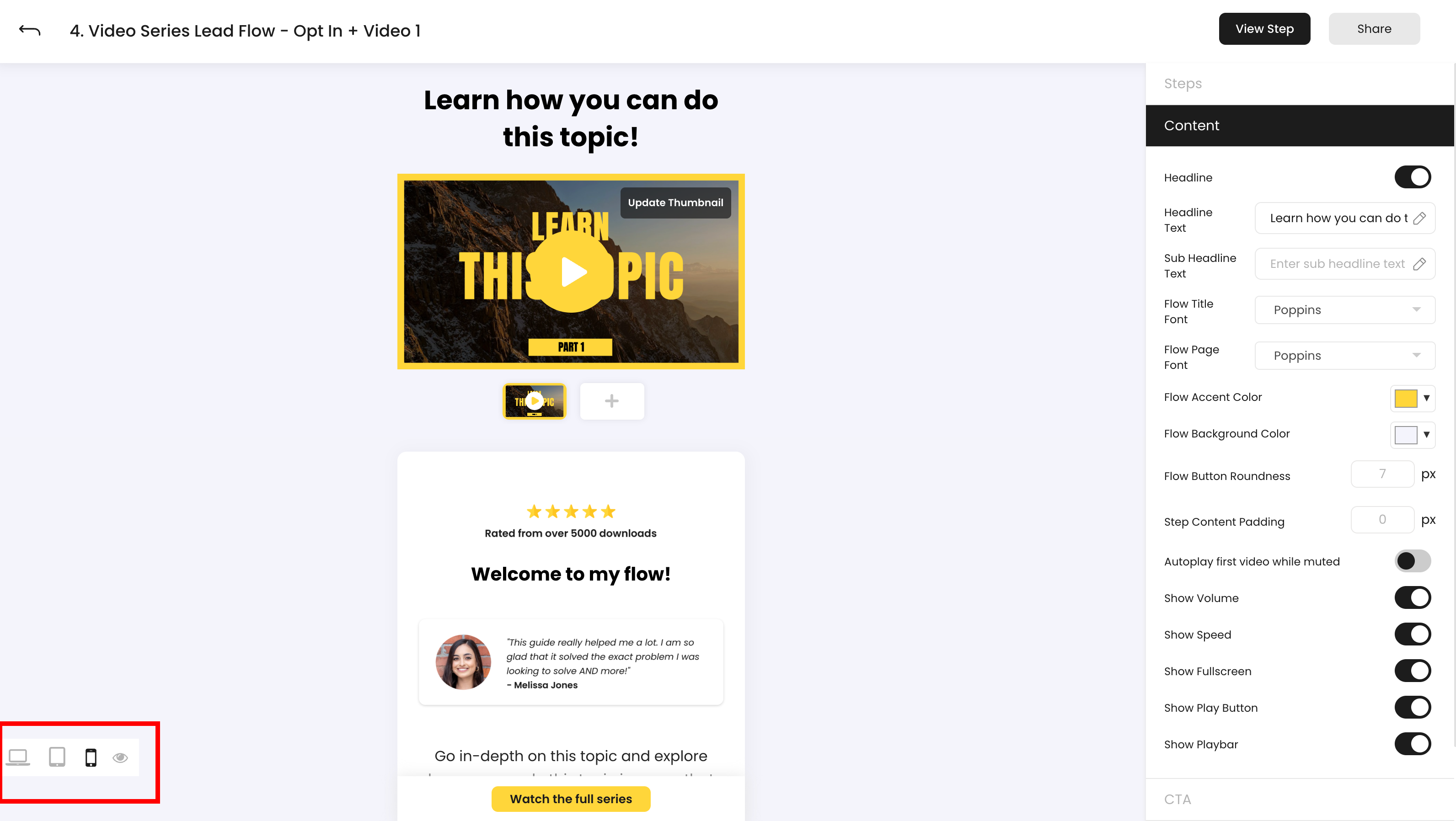
Mobile Scaling
To optimize how your Flows look on mobile, separate controls for each section can be accessed on the left side menu next to the section you’d like to adjust.
You can adjust padding, font sizes, and more to make your pages look and perform how you’d like on mobile.
Mobile scaling options that appear for Flow elements not contained in sections, like your main CTA, appear inside of the right side menu.
Mobile Visibility
You can toggle any section to only appear on desktop or only appear on mobile. This can be useful in specific cases where you may like to display different media, different text, etc. for different display sizes.
To toggle on or off your hidden elements on mobile or desktop, click the eye icon next to the devices at the bottom left of the Flow Builder.